Striking the Balance: Performance and Aesthetics in JavaScript Charting
The Importance of Data Visualization
Today, the ability to present data in a clear and comprehensible way is more important than ever. Whether it’s for business analytics, scientific research, or public information, data visualization helps to break down the barriers of complexity and enables a wider audience to understand and engage with the data. JavaScript charts plays a pivotal role in this process, providing the tools necessary to transform raw data into meaningful stories.
JavaScript Charting Libraries: A Diverse Landscape
The JavaScript ecosystem is rich with libraries and frameworks designed for data visualization, each offering a unique set of features and capabilities. Libraries such as D3.js, Chart.js, Highcharts, and many others provide developers with a vast array of options for creating charts. While D3.js stands out for its powerful and flexible approach to data visualization, allowing for highly customized visual representations, Chart.js and Highcharts offer a more straightforward path to creating interactive and responsive charts with less coding effort.
Balancing Performance and Aesthetics
The challenge of balancing performance and aesthetics in JavaScript charting is a nuanced one. On one hand, the visual appeal of charts is paramount to engaging users and effectively conveying the data’s story. This often requires sophisticated graphical elements, animations, and interactivity, which can be resource-intensive. On the other hand, performance is critical to the user experience, especially in web applications where speed and responsiveness are key. High-performing charts ensure that users can interact with the data smoothly, without frustrating delays or lags.
Performance Considerations
When it comes to optimizing performance in JavaScript charting, several factors come into play. The size of the dataset, the complexity of the chart, and the efficiency of the rendering process all impact how quickly and smoothly a chart can be displayed. Developers must consider these aspects carefully, implementing best practices such as minimizing the amount of data processed and displayed, using efficient data structures, and leveraging browser capabilities for hardware acceleration.
Aesthetics and User Engagement
While performance optimization is crucial, it should not come at the expense of the chart’s visual quality and user engagement. A well-designed chart not only presents data clearly but also captures the user’s interest and encourages exploration. This involves thoughtful design choices, such as color schemes that enhance readability, layout and typography that guide the user’s eye, and interactive elements that invite user interaction. Achieving a high level of aesthetic appeal requires a deep understanding of design principles as well as the capabilities of the chosen JavaScript charting library.
Best Practices for Balancing Performance and Aesthetics
To strike the right balance between performance and aesthetics, developers should follow a set of best practices that cater to both aspects simultaneously. These include:
Selective Loading of Data: Implement techniques such as lazy loading or incremental data loading to ensure that only the necessary data is processed and rendered at any given time.
Simplify Visual Elements: While intricate designs can be visually appealing, they can also be performance hogs. Simplifying chart elements without sacrificing the overall design can significantly improve performance.
Responsive Design: Ensure that charts are responsive and adaptable to different screen sizes and devices, enhancing both aesthetics and performance on a wide range of platforms.
Use of Caching and Optimization Tools: Leverage browser caching and optimization tools to reduce load times and improve the efficiency of chart rendering.
By adhering to these practices, developers can create JavaScript charts that not only look great but also perform seamlessly, offering users a delightful and informative experience.
Advanced Techniques for Optimized Charting
Efficient Data Handling
One of the primary concerns when dealing with large datasets is the efficiency of data handling. Developers can use various strategies, such as data aggregation and downsampling, to reduce the size of the data being processed without losing significant details. For instance, aggregating data points over specific time intervals can provide a clear overview without overwhelming the chart with too many points.
Progressive Rendering
Progressive rendering is another technique that can greatly enhance performance. Instead of waiting for all data to be processed and rendered at once, charts can be displayed incrementally as data is loaded. This approach provides immediate feedback to the user, improving the perceived performance and keeping the user engaged.
Leveraging Modern Web Technologies
The evolution of web standards and technologies offers new opportunities for optimizing JavaScript charting. WebAssembly, for example, allows for the execution of code at near-native speed, which can significantly boost the performance of data processing and rendering tasks. Similarly, WebGL can be used to render complex graphical elements more efficiently than traditional SVG or canvas-based solutions, enabling smoother interactions and animations even with large datasets.

Case Studies: Success Stories in Balancing Performance and Aesthetics
Real-Time Financial Dashboards
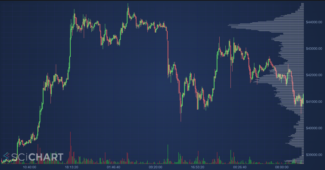
Financial dashboards are a prime example of where the balance between performance and aesthetics is critical. These applications often require real-time updates and high levels of interactivity, all while maintaining a polished and professional appearance. By employing techniques such as efficient data streaming, selective updates, and GPU-accelerated chart rendering, developers can create dashboards that are both fast and visually appealing.
Interactive Scientific Visualizations
Scientific visualizations present unique challenges due to the complexity and volume of the data. Case studies in this domain demonstrate the effectiveness of using dynamic data structures and multi-threaded processing to manage data efficiently. Moreover, employing intuitive design principles helps in making complex scientific data accessible and engaging to a broader audience.
Emerging Trends in JavaScript Charting
AI and Machine Learning Integration
The integration of AI and machine learning models into JavaScript charting libraries is an emerging trend that promises to revolutionize data visualization. These technologies can assist in automating the selection of chart types, optimizing layouts, and even generating insights directly from the data, all of which contribute to both performance and aesthetics.
Accessibility and Inclusivity
As the importance of accessibility in web development gains recognition, JavaScript charting is also evolving to meet these standards. This includes developing charts that are not only visually appealing but also accessible to users with disabilities. Techniques such as keyboard navigation, screen reader support, and alternative text descriptions are becoming standard practices, ensuring that data visualization is inclusive and available to everyone.
Conclusion
The quest to balance performance and aesthetics in JavaScript charting is an ongoing journey, shaped by technological advances, evolving design trends, and the ever-growing importance of data.


